Ich habe gerade zwei neue Themen-Vorschläge auf der Ubuntu-Style-Mailingliste gesehen, die wirklich sehr gelungen sind…
(https://wiki.ubuntu.com/Artwork/Incoming/Hardy/Alternate/BasicIdeals)
(https://wiki.ubuntu.com/Artwork/Incoming/Hardy/Alternate/Hardline)
Entschuldigen sie meine Deutsch…
Ich finde diese Themen sehr scheusslich. Blau und grau sind besser.
Come on !!! Give it up with this brown and orange shades. And that brown looks like shit-brown. Awfully screwed !!
Hmm, also so richtig überzeugen können die Screenshots mich nicht. Gab es nicht auch mal einen Vorschlag der auf den Farben Schwarz und Orange basierte. Das sah meiner Meinung nach vielversprechender aus.
No more monkey colours please!
Get real!
Ubuntu is never going to fully catch on till they ditch the brown. Love of god lose the brown!!
sorry but that looks horrible
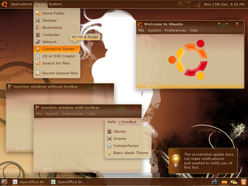
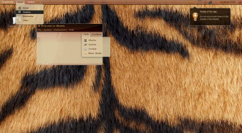
New Ubuntu Hardy Theme Mockup…
Two amazing mockups of the new Ubuntu Hardy Theme!…
[…] ????: Slyons Ubuntu Infos […]
Looks great! Keep up the good work
Ditch the brown! WHY THE PREOCCUPATION WITH THE ORANGE/BROWN THEMES???
Looks like no one likes the brown. Time to change?
yuck. down with brown!
Der zweite shot ist ja mal der Hammer, auch wenn ich die Fenstrahmen für zu dunkel halte und die untere Leiste fehlt. Aber sonst geht es schon in die richtige Richtung.
Aber war nicht mal angedacht, dass der kommende Theme Schwarz/Orang sein soll? Ich sehe weder das eine noch das andere.
Mir persönlich gefällt das erste theme besser, aber in beiden themes sind die kontraste der icons in den panels nicht ausreichend! leite das bitte an die leute weiter, die es auf der mailingliste verbreitet haben, danke.
I personally prefer the first theme, but in both themes the contrast between the icons and the panels are not strong enough!
Hire a professional to design the desktop. Nothing like making a great system and putting a crappy interface on the front of it!
wow, just one or two more revisions and it will look just like Leopard!
i agree that the brown is ugly, but the whole point of ubuntu is that it is completely customizable, so really if the brown bothers you please change it. its easy, and if you can get over the brown, its probably the best os.
Es war zuerst ein Schwarz/Orange-Theme angedacht, doch nun wurde dieser Plan wieder verworfen. Diese Mockups werden wohl so auch nicht das Theme für Hardy werden, es sind nur Vorschläge von Usern.
slyon
seriously, give up the brown. Its way too ugly.
Please tell me this is some sort of sick joke. I will stop using Ubuntu on my home PC if I have to look at that bullllllshit. (Or I will at least change the theme immediately.) Come on guys… Do something that will appeal to more than 2% people for once. This whole thing is nice for the Ubuntu community pride, but it makes us look like a laughing stock to everyone else. I want my desktop to look visually appealing, not like someone pulled their pants down and shit on it…
Na se ve horrible, demasiado oscuro!!!
[…] retiradas de: Slyons Ubuntu Infos Submeter: Fixolas.com – DoMelhor.net – EuCurti.com.br – Del.Icio.Us – […]
Sehr shön!
your wallpaper is awesome, can you tell where you got it from?
follow the links under the screenshots 😉
[…] Está circulando pela internet uma imagem que pode ser o tema do próximo Ubuntu (8.04). Não há nenhuma confirmação oficial à esse respeito. Para ver outra imagem, clique aqui. […]
[…] Saiba mais (blog.slyon.de). […]
translucent brown? haha fucking hell how horrible
I can wait for the new gnome.
Ditch brown and the top panel.
Linux Mint is the same Ubuntu with minor visual changes, but it makes such a massive difference!
This is just too ugly to look at.